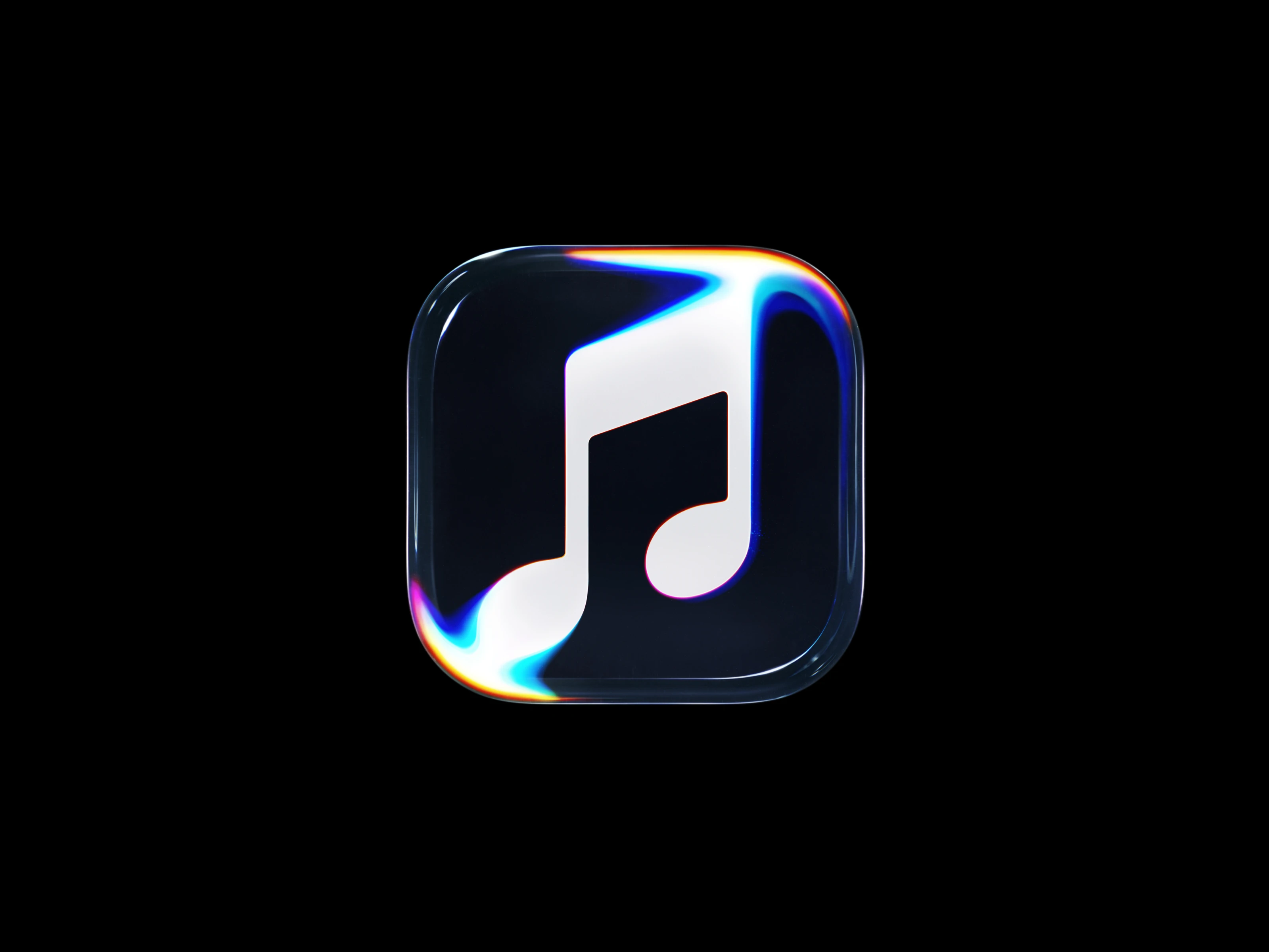
APPLEMUSIC
An Identity Made by Sound
Apple Music’s new identity began with a physical constraint: a limited set of notes had to move mineral oil in ways a camera could use. Inside the collaboration between TBWA\Media Arts Lab, Optical Arts, Fred again.., NEST Acoustics, and Plau.
: A limited set of notes
Optical Arts’ tests established which pitches produced usable ripples. Those notes became the material Fred again.. and NEST Acoustics had to compose with: a musical phrase could sound right and still disrupt the image.
In his interview with It’s Nice That, James Taylor, TBWA\Media Arts Lab’s global head of design, explains that sound was initially intended only to generate visuals. The ambition to make a sonic signature followed. The restriction appealed to Fred; Taylor recalls him saying, “I want to do this because this is hard.”
: In the tank
The brief connected the service to Apple’s wider Liquid Glass design language. Speaking to Marketing Brew, Taylor describes looking for a way to give that glass-like appearance a musical basis. TBWA\Media Arts Lab and Optical Arts had already collaborated on the Apple TV identity; here, sound would supply the movement.
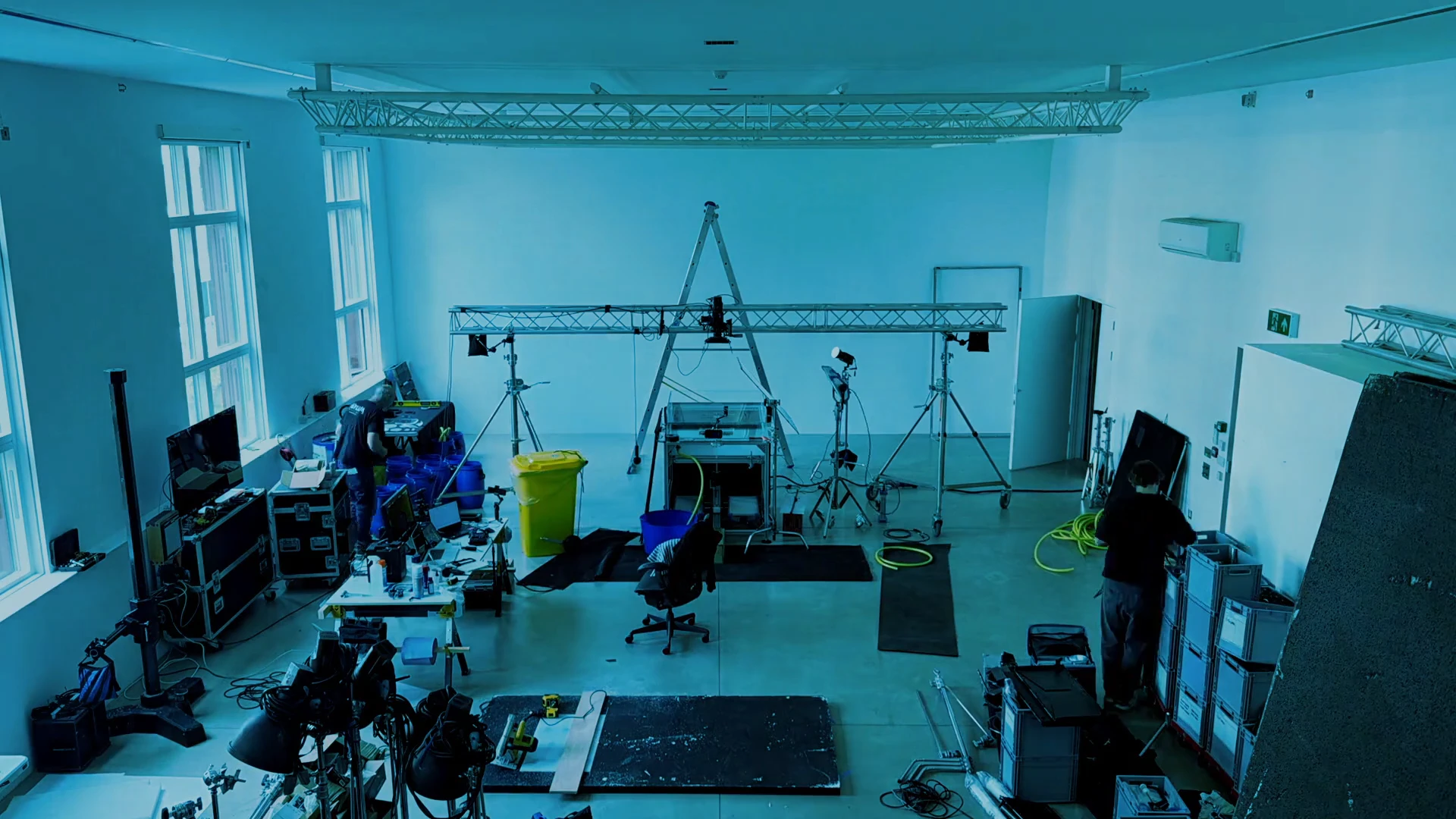
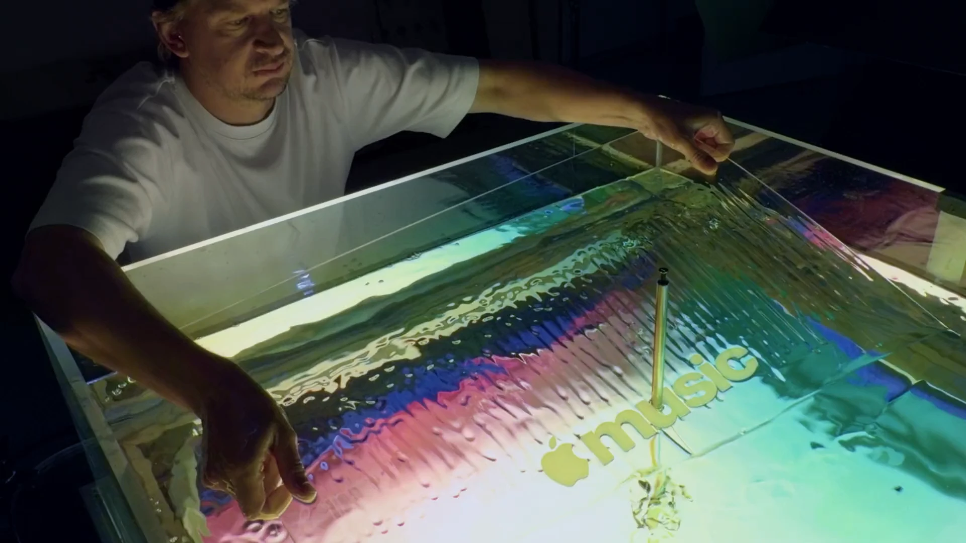
Optical Arts placed acrylic versions of the note and wordmark beneath mineral oil. A transducer converted an audio signal into mechanical vibration, driving the movement that distorted the shapes through the liquid. The production accounts describe testing different oil viscosities and frequencies: too many notes, or pitches that were too high, could make the surface too turbulent for the image to remain readable.
The rig also required custom software. In the It’s Nice That account, Taylor describes translating notes into sine waves to control the mechanism, then compositing separately photographed frames for the finished animation. The tank supplied the photographic material; editing and finishing shaped its final presentation.
: Inside the music
“We wanted all of the textures and layers around it to move and breathe together,” NEST explains in his process film. He is talking about the sounds surrounding the melody, which needed to remain clear within the arrangement.
Opening the music session, he plays discarded versions and isolates the layers of the finished signature. Synthesised tones are combined with low, underwater textures; samples are cut and stretched to give the splashes more weight. The breakdown shows how the liquid character of the image is carried into the sound through texture, timing, and the relationship between layers.
The closing piano flourish comes from a recording of “young Fred at 10 years old”. NEST says it was sped up for the finished piece. That detail gives the signature a personal history: a childhood performance is folded into a sound intended to identify a global music service.
The wordmark
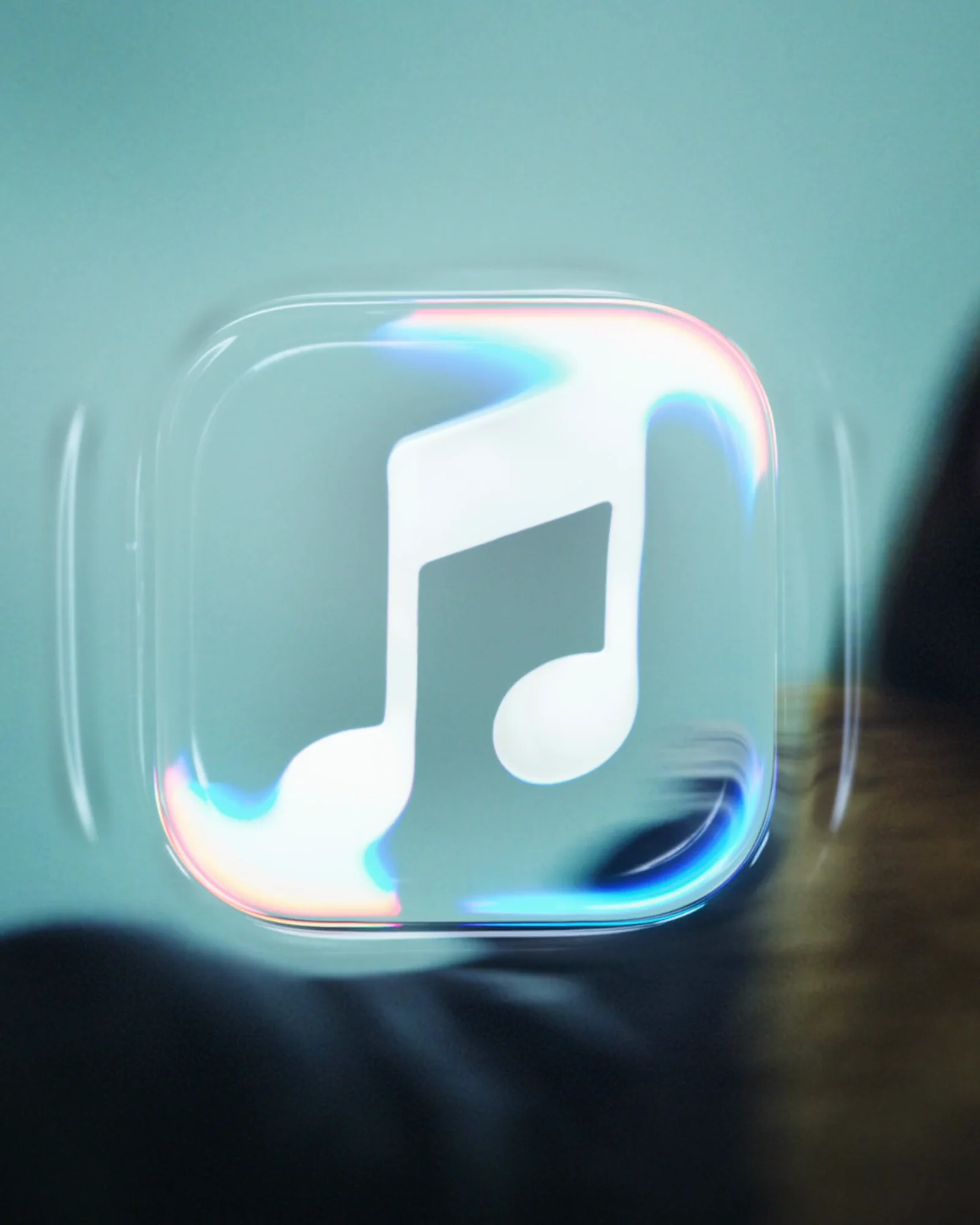
In the animation, the note’s two heads stretch and its stem bends across the frame. The lettering receives the same refractive treatment, but also appears in a plain form. Its proportions and spacing need to survive both uses.
The agency’s launch account identifies the wordmark as a customised version of SF Pro, pairing bold lowercase lettering with the Apple symbol. Rodrigo Saiani, founder of Brazilian type studio Plau, identifies his contribution as refining, spacing, and finishing the wordmark.
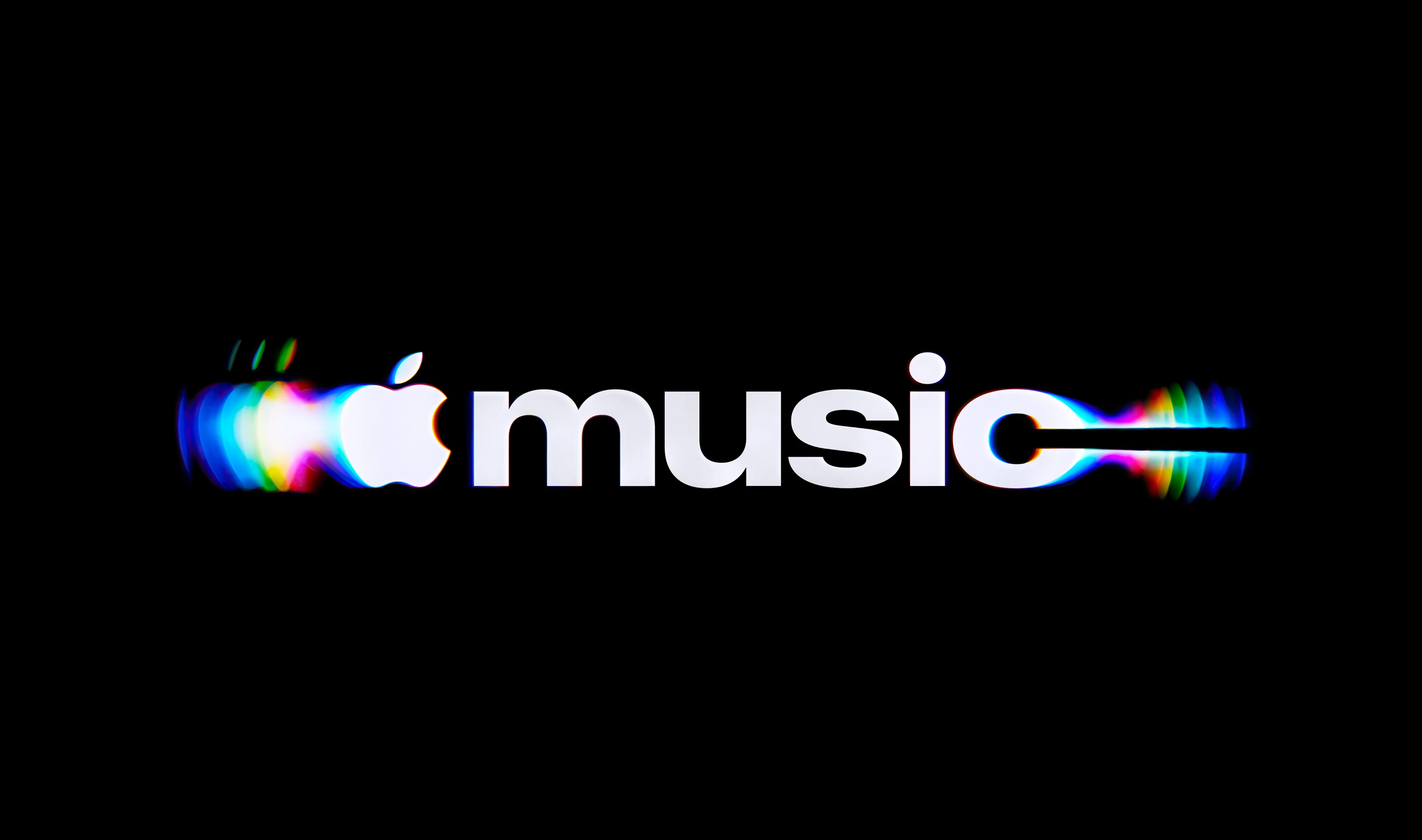
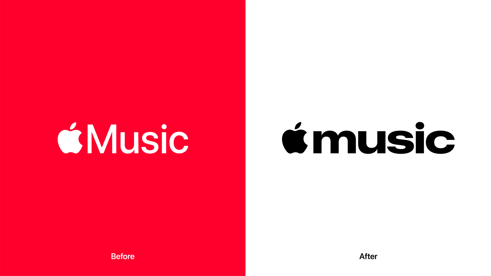
The new lettering is wider. Taylor also describes adjusting the balance between the M and the Apple symbol in his It’s Nice That interview. The comparison draws attention to a quieter design task: making the two elements read together as a single mark before any distortion is applied.
Away from the tank
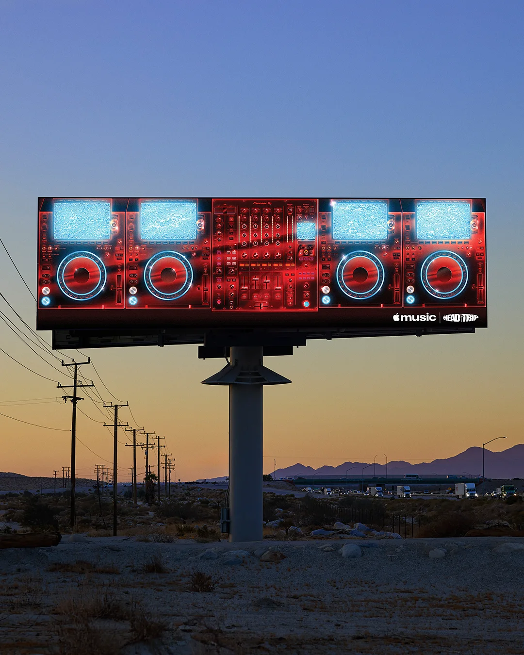
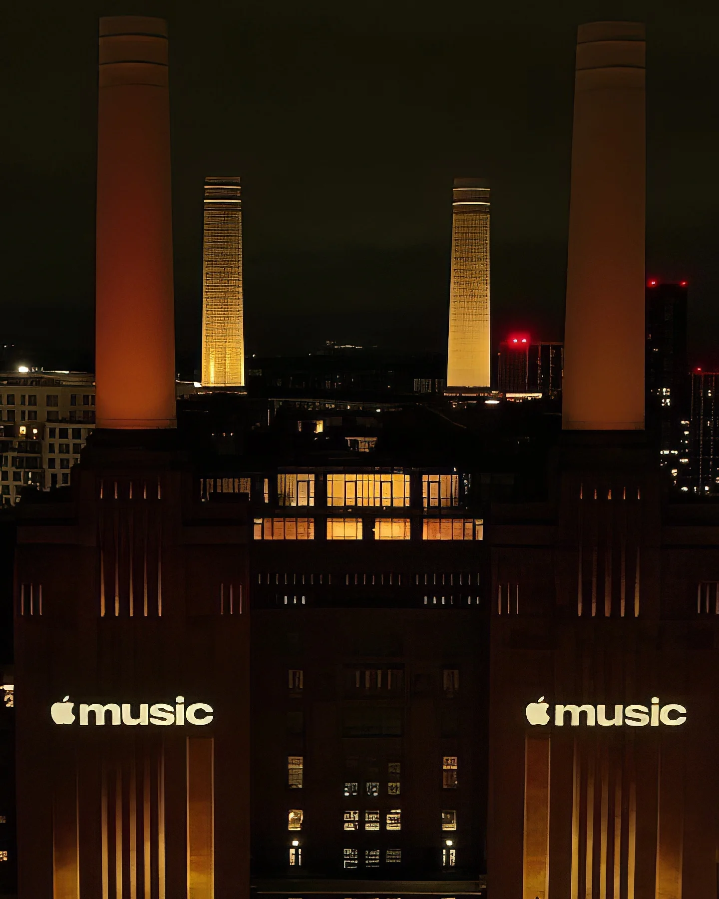
The campaign shows the identity working across several scales. Red DJ equipment supplies the colour in the roadside placement, with the white wordmark set against the image. In the film, the refracted note is layered over performance footage. At Battersea Power Station, the lettering is projected onto the building. The contrast between these applications matters: the core mark can remain black or white while the surrounding photography carries a much broader palette.
At Apple Music Hall, the wordmark becomes a physical sign against a timber wall. Here its letterforms and spacing do the work without refraction or a soundtrack. Seen together, the applications show why the project needs both an expressive motion treatment and a straightforward identifying mark.
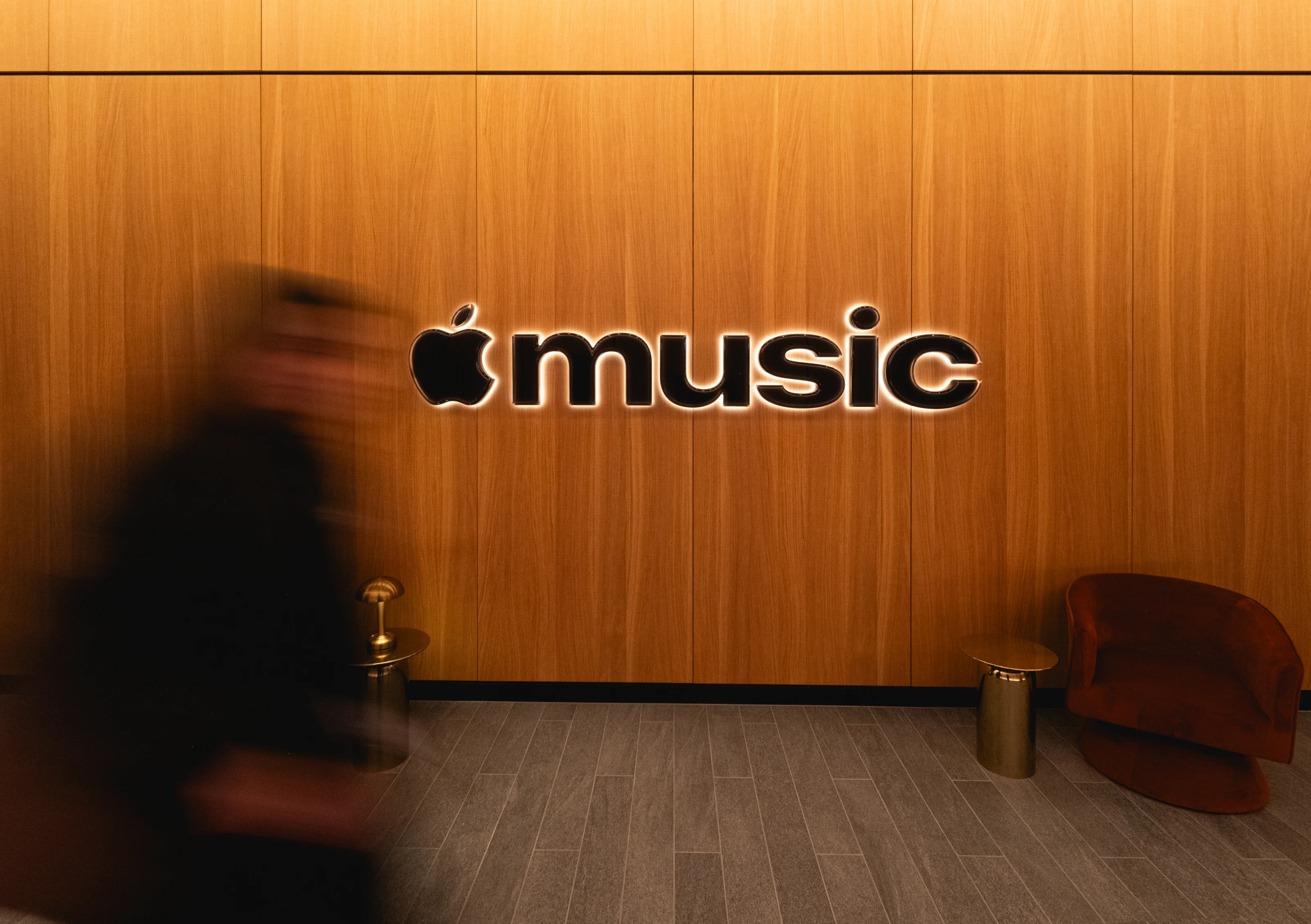
: In perspective
The studio film makes the identity’s central relationship visible: sound moves the liquid, and the liquid changes how an existing shape is seen. Watching that process gives the finished distortion a cause the viewer can understand. It also makes the testing, apparatus, and people part of the public presentation of the work.
There is a useful parallel in Optical Arts’ earlier film Order in Space, where simple geometric forms appear and dissolve through physical effects, including ripples in water. Viewed alongside this project, it shows a recurring interest in the point at which a recognisable shape becomes unstable.
For a brand identity, that instability has a practical limit. The note and lettering can become unfamiliar for a moment, but still need to resolve into something identifiable. The strongest aspect of this project is the coordination of those demands: the musicians work within the image’s limits, while the visual treatment gives their sound a physical presence.
This could become a turning point in how Apple Music presents itself. An identity built from sound gives the service a convincing way to put music at the centre of its image, with the musicians’ contribution visible in the finished work. That might give people a reason to look at it again. Whether it changes the app’s reputation will depend on what follows: the listening experience has to make that renewed attention worthwhile.
Behind the work
Identity and production
- Client
- Apple Music
- Agency
- TBWA\Media Arts Lab
- Global head of design
- James Taylor
- Director
- Joe Jackson
- Production
- Optical Arts
- Type consultation / vector reconstruction
- Plau
Sound and finishing
- Music
- Fred again.. and NEST Acoustics
- Music mix
- Model Citizen
- VFX
- Time Based Arts
- Colour / finishing
- TRAFIK
- Stills retouch
- Optical Arts
- Stills post / colour conversion
- Epilogue Inc
Sources
| Source | Title |
|---|---|
| Optical Arts | Apple Music — project, films, and director credit |
| It’s Nice That | Elizabeth Goodspeed’s interview with James Taylor, 28 October 2026 |
| Fast Company | For the new Apple Music logo, designers lean into the science of sound |
| NEST Acoustics | First-person process film; Rodrigo Saiani’s contribution is identified in the comments |
| Little Black Book / TBWA\Media Arts Lab | Launch account and press imagery, 21 October 2026 |
| Manifest | Published project credits |
| Optical Arts | Order in Space |
| Marketing Brew | Kristina Monllos’s interview with James Taylor, 28 October 2026 |